From family recipe to demand‑ready storefront.
Custom Shopify Website Design
Mama House sauce with founder & chef Pana Thitaram
Founder and chef Pana Thitaram brought two exceptional Thai BBQ sauces and a Thailand-to-Tennessee story worth telling. I brought everything around them, the brand's voice, its audience, its guidelines, its design, its copy, its photography, and finally the Shopify code it all ships on.
A great sauce is not a brand. Yet.
Mama House Sauce launched with everything money can't buy, a genuine family recipe, a first-generation founder's story, and flavor that holds its own on any grill. What it didn't have: a defined voice, a pinpointed audience, a reason to stand out on a shelf crowded with BBQ bottles, or any online presence at all. The BBQ sauce aisle is full of brands that borrow "exotic" flavor. The mandate was to build one that could prove it comes by its heritage honestly, and get found for it, locally and in AI search.
Pana had the recipes and the story. My job was clarity, who Mama House is, who it's for, and why it deserves the shelf space, before a single pixel got designed.
Strategy. Design. Code. One pair of hands.
Most startups hire a strategist, then a designer, then a developer, and lose the thread twice in the handoffs. On Mama House, the person who defined the brand voice also wrote the copy, designed the pages, and coded the theme. Nothing was lost in translation, because there was no translation.
Established Clarity
Defined who Mama House is before deciding how it looks, then wrote it all down so every future channel stays on-brand.
- • Brand tone
- voice
- mission & values
- • Brand story & differentiation
- real heritage vs. borrowed flavor
- • Target audience definition
- • Local SEO & online visibility strategy
- • Complete online guidelines
- website through social
Designed the experience
A custom, mobile-responsive design with a style you won't find in a theme store, and every word on it.
- • Custom UX/UI
- desktop & mobile
- • Original photography & art direction
- • All website copy
- in the brand voice
- • Polaroid & watercolor storytelling system
Coded the storefront
After design approval, I built the approved design myself, pixel-faithful, fast, and structured to be found.
- • Custom Shopify theme development
- • UX/UI principles applied in code SEO tactics
- local & on-page
- • AEO
- structured for AI answer engines
Six decisions that shaped the site.
Every screenshot below is the real, shipped site at www.mamahousesauce.com, designed, written, and coded by me from the brand foundation up.
01 — Positioning & homepage
Two sauces, one choice: your vibe.
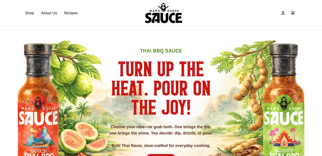
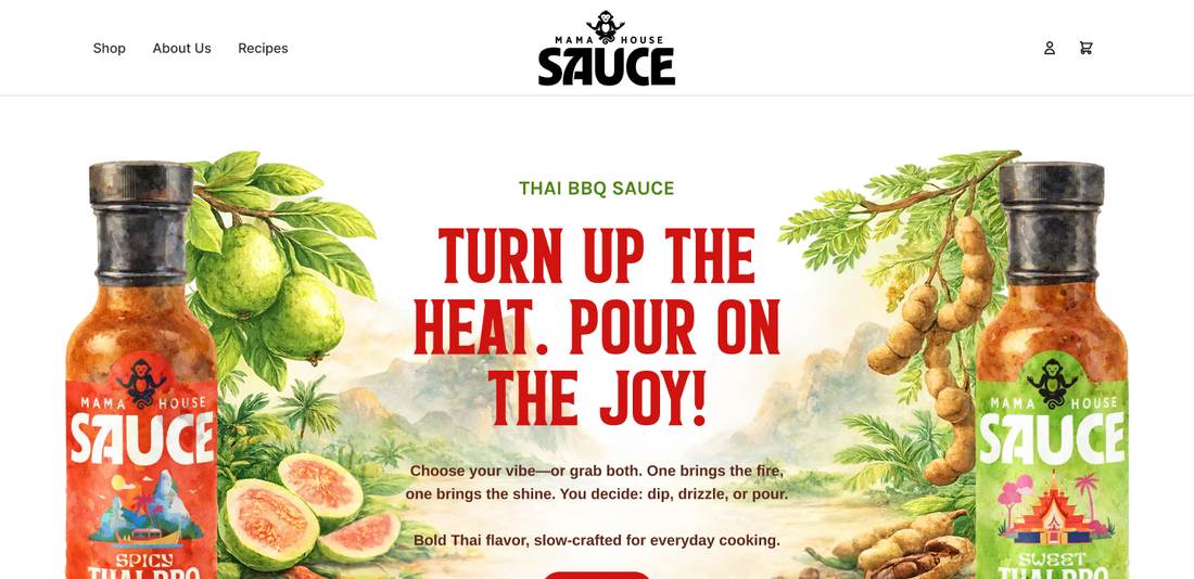
The brand strategy landed on a duality — Spicy brings the fire, Sweet brings the shine — and the homepage hero sells that choice in one breath: "Turn up the heat. Pour on the joy." Custom watercolor artwork of guava, tamarind, and Thai chili grounds the bottles in their real ingredients, and the red/green SKU color system starts here and never breaks, all the way to checkout.
02 — The clean-label argument
Differentiation you can see.
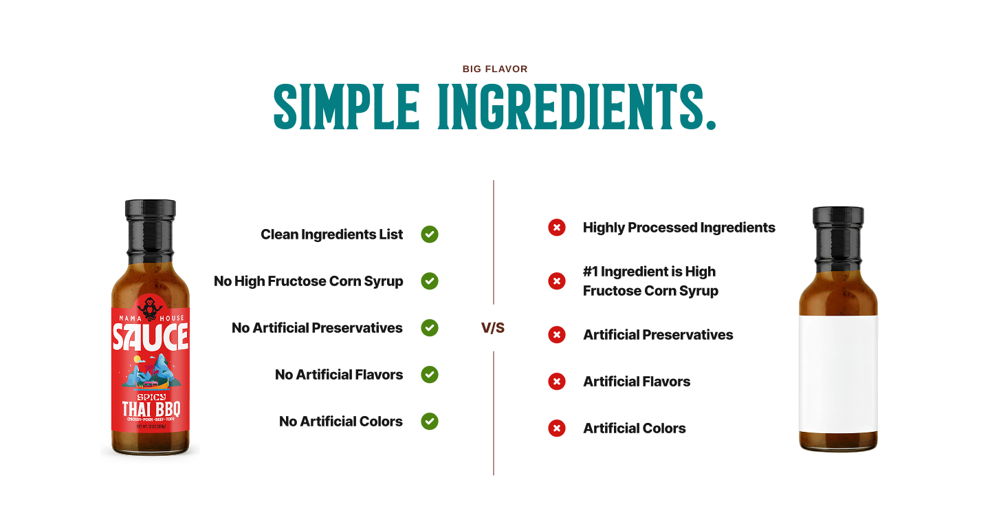
The strategy work identified Mama House's sharpest edge against grocery-shelf BBQ: no high-fructose corn syrup, no artificial anything, real tamarind, guava, and coconut sugar instead. Rather than bury that in body copy, I designed a side-by-side comparison module that puts Mama House's label next to the generic bottle. It turns an ingredient list into a conversion argument.
03 — Heritage storytelling
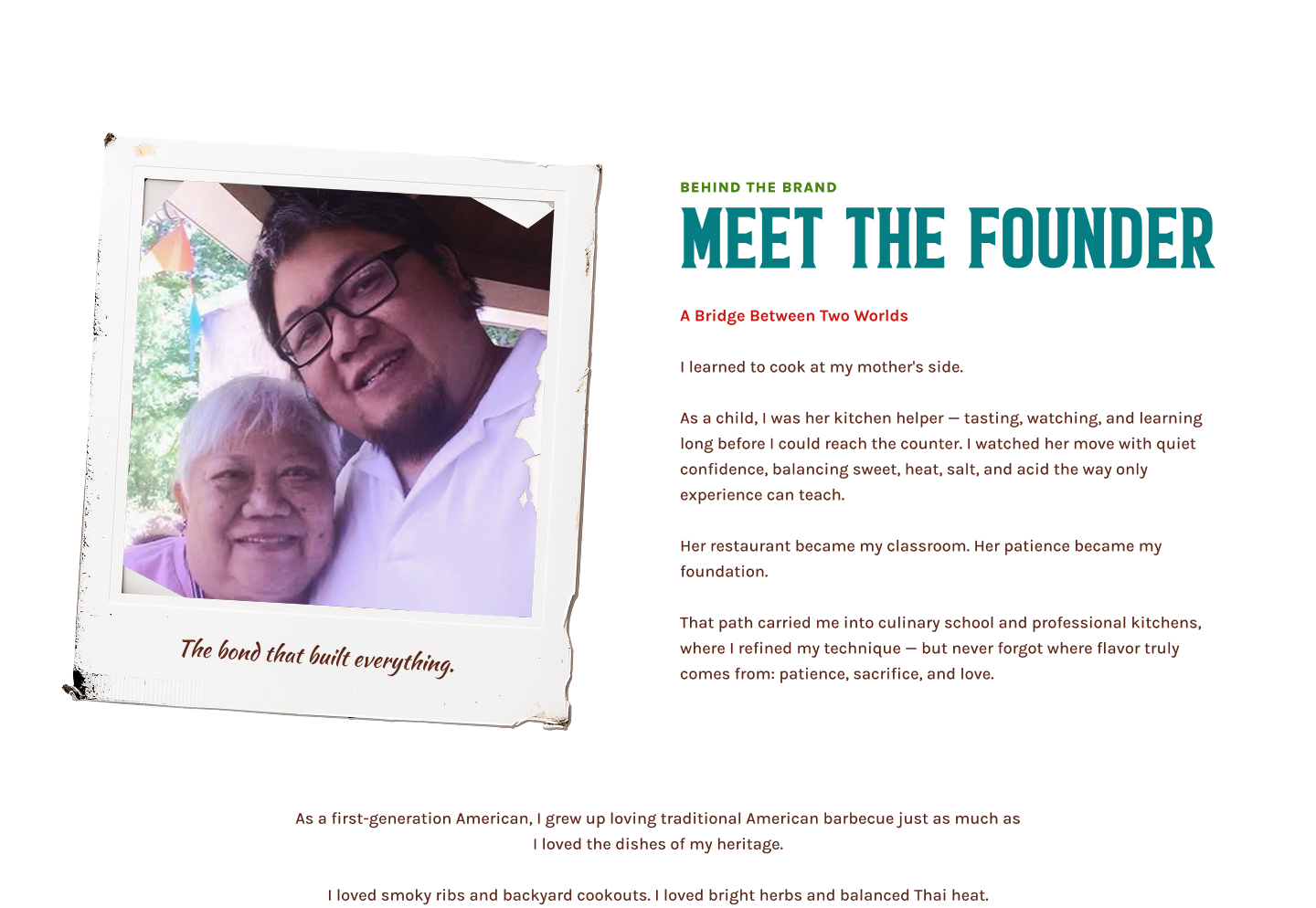
A story told in polaroids.
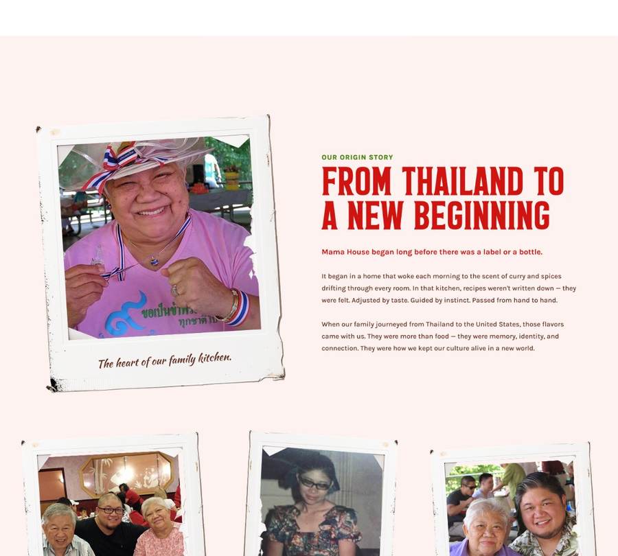
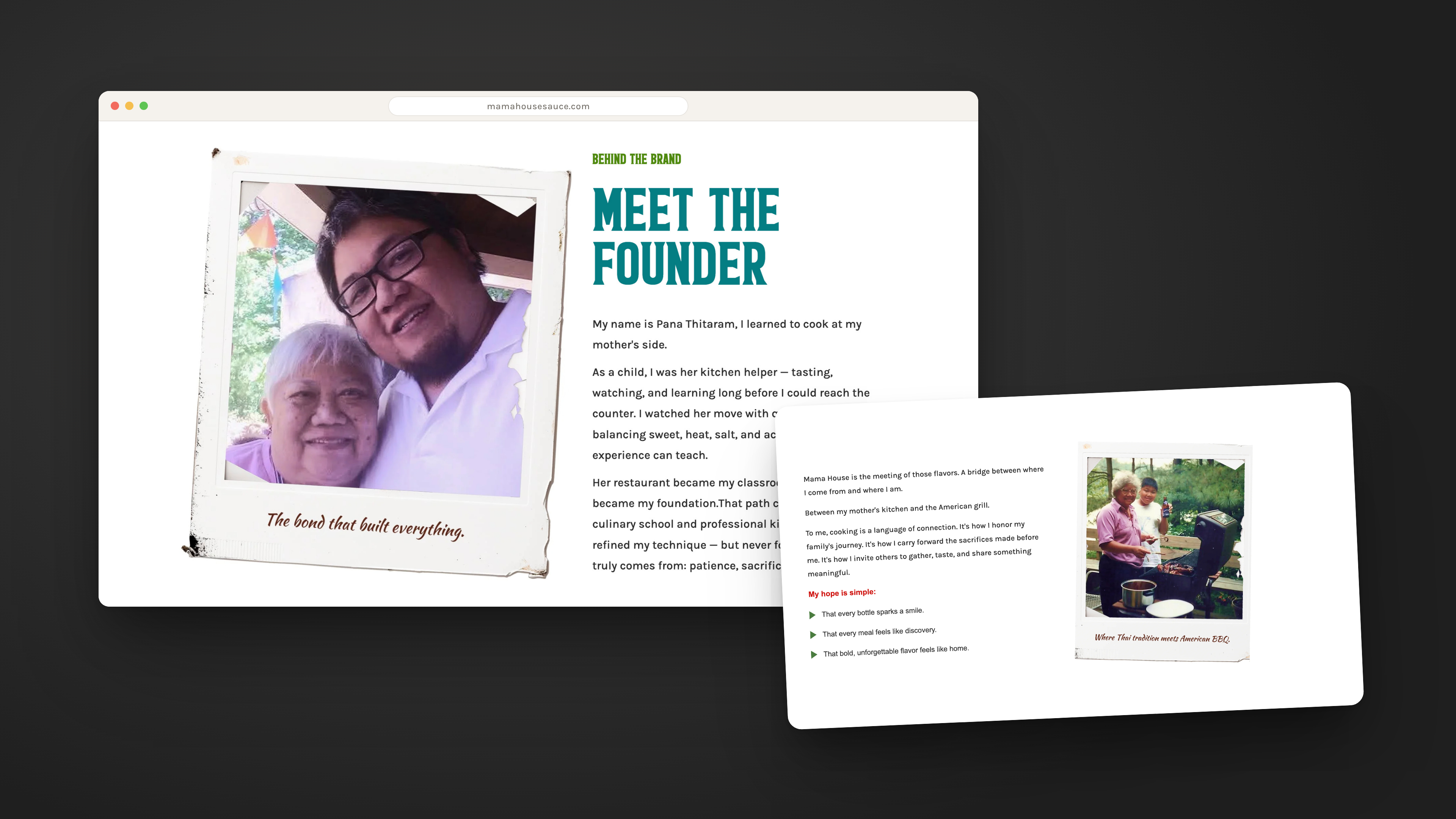
The about page carries the brand's soul: a family's journey from Thailand to an American backyard. I designed it as a photo album, real family polaroids with handwritten captions, tilted like they were just set down on the table, and wrote the story arc from "From Thailand to a New Beginning" through "Meet the Founder." It's the page that proves the heritage other sauce brands only imply.
04 — The founder as the brand
A bridge between two worlds.
Pana's biography is the positioning: a first-generation American who learned to cook at his mother's side and fell in love with backyard American barbecue. The copy I wrote frames Mama House as neither compromise nor gimmick, "not as a compromise, but as a celebration." That single line, born in the brand-voice work, became the through-line for every page.
05 — Product pages, mobile-first
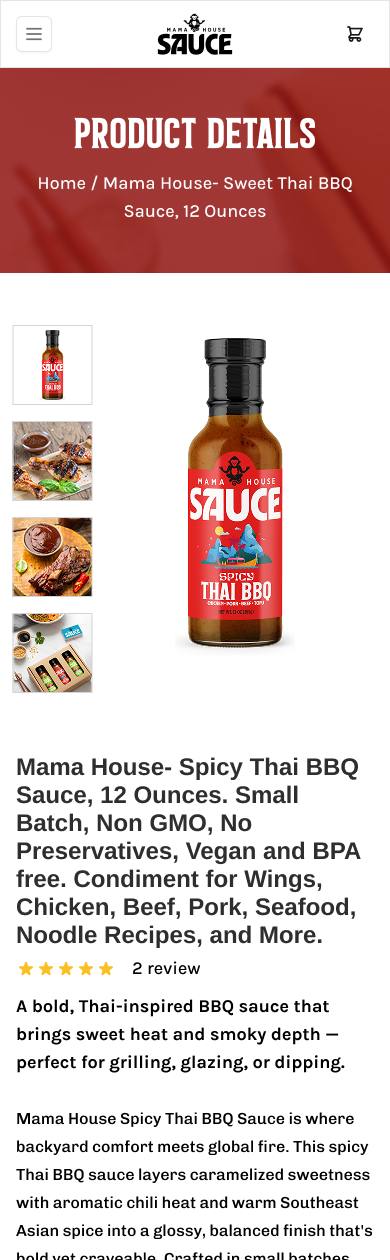
Each bottle gets its own world.
Most product pages stop at price and add-to-cart. These keep going: below the buy box, each sauce unfolds into its own brand moment, a slow pour, custom display lettering, a "Marinate, Glaze & Dip" use-case guide, and a "Thoughtful Ingredients" section starring tamarind pulp and guava puree. Spicy lives in red, Sweet in green, and the whole experience was designed for the thumb first, most sauce discovery happens on a phone.
06 — Built to be found
SEO for Google. AEO for everything after.
A beautiful site nobody finds is a brochure. The build layers local SEO for the searches that matter to a startup sauce brand, and AEO, answer engine optimization, so that when someone asks an AI assistant for a clean-ingredient Thai BBQ sauce, Mama House is structured to be the citable answer. Product schema, semantic markup, descriptive alt text, and answer-shaped content were coded in from the start, not retrofitted.
Written down, so it survives.
Everything on the site follows the online brand guidelines I created for Mama House, a single document covering voice, color, type, photography, and social. The guidelines are why a homepage hero, a product page, and a future Instagram post will all feel like the same brand, whether or not I'm the one making them.


PRIMARY — CleanGreen, reserved for the revenue action. Hover deepens to Green-700, disabled mutes.
SECONDARY — steel FreshBlue-700 for in-page actions. DARK — DeepBlue for photo & blue backgrounds. OUTLINE — phone & quiet actions on white.
Inline links use FreshBlue-900 with an underline that thickens on hover; footer and dense-UI links stay quiet until touched. Focus rings are FreshBlue-700, 3px, offset — visible on every interactive element.
Strategy before pixels. Pixels before code.
The order is the method. Every phase fed the next, and because one person carried all of them, nothing got lost between the handoffs, there weren't any.
Clarity
Voice, mission, values, story, audience, differentiation, with Pana, before anything visual.
Guidelines
The full online playbook, website through social, written down.
Design
Custom mobile-responsive design with its own style, nothing off a theme shelf.
Content
Photography and copy created in the brand voice, page by page.
Build
Coded the approved design as a custom Shopify theme, pixel-faithful.
Visibility
Local SEO and AEO structure deployed with the launch, not after it.
Final Results of the Project



Live, launched, and legible to the machines.
Mama House Sauce went from a recipe and a story to a brand with a voice, a rulebook, and a storefront built to be found — by neighbors searching locally and by AI engines answering the world. Built shoulder to shoulder with Pana: his heritage and craft, my strategy, design, and code.
Got a great product and no brand around it? Let's build you a store in Shopify.
You bring the recipe, the product, the story, the craft. I'll bring the clarity, the design, the copy, and the code, and ship you a storefront that demands to be found.